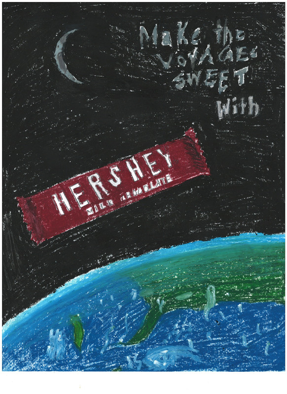
I thought it would be nice to make a poster/ad about Hershey Bars in space. I love Hershey chocolate so I thought why not? Here are the results:
I used Oil Pastels, and I am not very good at those. I am terrible at using them, but
I thought it would be nice to make a poster/ad about Hershey Bars in space. I love Hershey chocolate so I thought why not? Here are the results:
I used Oil Pastels, and I am not very good at those. I am terrible at using them, but


@Hyperant I did read, hence my comment saying it's good for someone as inexperienced as yourself. Never meant to make you feel awkward.

If you read the entire forum, you should understand that I am not very good with Oil Pastels. There were also many factors to acknowledge, such as the Oil Pastels were already user and had an irregular tip, which made it difficult to trace the letters. The crescent moon is just for the views, and the planet has different lighting so people can actually see that it is Earth, with clouds. The title was made before coloring the poster, which (as I had said prior) meant that I had to trace them and it wasn’t perfect. This is my second time drawing with Oil Pastels, so it’s no wonder that it looks odd. I do appreciate your notice on the atmosphere, that I put a lot of effort into because I have the problem of doing it poorly when drawing other planets. It was my plan to make the moon fuller and not a crescent, but I thought otherwise just for the aesthetics. Thank you for pointing these things out, @LeMagicBaguette , but it does make me feel awkward when people “criticize” me.
Yum
As for aesthetic criticism, you definitely do need work in colour and fill consistency, and you would probably be better off trying to paint on the Hershey's Chocolate Bar rather than trying to avoid painting it at all. The lighting is also inconsistent; you show a crescent moon, but the planet is fully lit, as is the chocolate bar. It is also quite hard to read the title.
On the plus, you got the very annoying process of atmosphere shading down almost perfectly. When looking towards the edges of the disk, the oceans and land become gradually bluer and paler, blending in with the atmosphere, but not seamlessly so, establishing a definitive boundary whilst still giving the sky the volume it needs.
Overall, I'd rate it with a 0.65, which isn't bad for someone of your alleged inexperience.
The title says, "Make the Voyages Sweet with [Hershey Milk Chocolate]"